Olay Skincare Boutiques – Global
Webb deVlam for Procter & Gamble
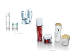
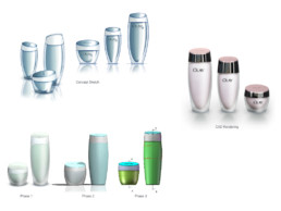
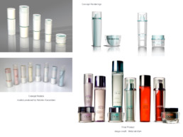
Project Goals: Olay had hundreds of skus globally. Their supply chain was complex, and research told us that Olay's appearance on shelf was confusing to customers. The Asian market was already saturated with super premium packaging, so to stay competitive, Olay needed a new look. Result: The Olay brand now has a universal look, and packaging is shared across many different boutiques, differentiated by smart material and decoration choices. The new packaging takes cues from department store brands and elevates Olay to “countertop-worthy” status. Olay has maintained its strong identity, but now stands out as renewed and fresh. The two designs separate Olay’s boutiques into tiers, and have at least one piece that can be colored differently for each boutique, making it easy to tell them apart, yet creating a unified brand look. This is particularly important in China and Korea, where the packaging sits out of the box and on display. Role: Project manager, designer, and CAD developer for Webb deVlam. Traveled to China, Korea, and the UK to meet with suppliers and attend consumer research.

